I like your design, and will mention specifics later.
There appear to different weights you hand rendered. Right?
Which font editing tool do you plan to use to create your OpenType font?
Did you consider to use also MS VOLT, as I believe you could accomplish many fascinating features that are far superior to the limited OpenType feature set of a few font editors.
I have worked a little with VOLT, and I believe many wonderful things can be done there which eclipse those done elsewhere.
But for the basic font editing, you do need to use a product like FontLab. Perhaps, the lower cost FontCreator can do this as well.
First, I like that first it is hand-renered. It has a much greater personal "non-machine made" appearance. As a result, it has a warmth, that even the best font lacks (usually).
Although I too am a graphic artist and type designer, my medium will always be the computer, software, and a mouse. So, I appreciate what I lack.
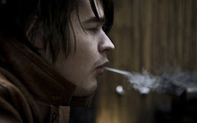
Btw, where's the junk? The first photo at an odd angle?
Second, (in order of display) I liked the caps. To me, the were alive and had movement. That's a rare quality in type, and a good application for your font by a perceptive graphic artist.
Third, you incorporated unconventional serifs. Much verbage could be spilled about the serifs of many letters. Are they a united set?
gohebrew : thank you for the kind words. I'm glad you like it. At the moment I have a full set of Regular and lowercase in bold. I plan to finish and implement the bold uppercase this weekend. I am not sure about OpenType, this is my 1st time designing a typeface, and so I will be sure to look into MS VOLT, thanks for the recommendation. However OpenType will have to wait, as at this moment i'm just finishing up the bold and getting everything ready for moderation. After I graduate I will no longer have an access to FontLab, so I will consider testing out the alternatives, and ultimately purchasing what I'm most happy with. So far my experience with FontLab has been great. I am from Russia, though i haven't lived there since i was 13. What do you mean by a united set in the last paragraph? Overall thanks for taking the time to write the comments!

3 comments:
Victor,
I like your design, and will mention specifics later.
There appear to different weights you hand rendered. Right?
Which font editing tool do you plan to use to create your OpenType font?
Did you consider to use also MS VOLT, as I believe you could accomplish many fascinating features that are far superior to the limited OpenType feature set of a few font editors.
I have worked a little with VOLT, and I believe many wonderful things can be done there which eclipse those done elsewhere.
But for the basic font editing, you do need to use a product like FontLab. Perhaps, the lower cost FontCreator can do this as well.
Btw, are you from Russia?
Why did I like your design? What was it?
First, I like that first it is hand-renered. It has a much greater personal "non-machine made" appearance. As a result, it has a warmth, that even the best font lacks (usually).
Although I too am a graphic artist and type designer, my medium will always be the computer, software, and a mouse. So, I appreciate what I lack.
Btw, where's the junk? The first photo at an odd angle?
Second, (in order of display) I liked the caps. To me, the were alive and had movement. That's a rare quality in type, and a good application for your font by a perceptive graphic artist.
Third, you incorporated unconventional serifs. Much verbage could be spilled about the serifs of many letters. Are they a united set?
gohebrew : thank you for the kind words. I'm glad you like it. At the moment I have a full set of Regular and lowercase in bold. I plan to finish and implement the bold uppercase this weekend.
I am not sure about OpenType, this is my 1st time designing a typeface, and so I will be sure to look into MS VOLT, thanks for the recommendation. However OpenType will have to wait, as at this moment i'm just finishing up the bold and getting everything ready for moderation. After I graduate I will no longer have an access to FontLab, so I will consider testing out the alternatives, and ultimately purchasing what I'm most happy with. So far my experience with FontLab has been great.
I am from Russia, though i haven't lived there since i was 13.
What do you mean by a united set in the last paragraph?
Overall thanks for taking the time to write the comments!
Post a Comment